A school web site has become a basic requirement for any primary school in Ireland today. Not only can they be used to give people information about a school, it can also serve as a valuable part of showcasing what’s going on behind the doors on a daily basis and can establish links with the greater community.
While it used to be sufficient to have a basic static web site, more and more schools are trying to make their school web site as professional as possible. The school web site may now be a person’s first impression of a school and a horrible looking web site might turn away potential enrollments.
We’ll be looking at the functions of a school web site and the things it should have. We’ll add a few hints and tips about things that shouldn’t ever be on a school web site, (for example, animated Santa clipart in May!), and some useful ideas that might help attract more visits. We’ll also look at the must-have features of a school web site. We’ll also look at colour schemes that work and are best avoided.
In the last few years, schools have realised the potential opportunities that a web site can bring them. Potential enrollments are just one. More importantly though is the satisfaction and pride that children have from seeing their work and their school on the Internet. In this article, we’re going to look at the elements that make up a powerful primary school web site. We’ll also look at a couple of colour schemes that schools might consider.
I think of a primary school web site in terms of a dynamic prospectus. Not only does it offer information about the school, it also shows off the things that makes your school unique. On top of that, it gives children in the school the opportunity to show off their projects to people around the world. While a paper prospectus is only updated every year or two, a school web site can change on a daily basis.
First things first – the informational aspect of a school web site: what kind of information do you want to put out to the wider world?
A contact page is essential. This page should offer the name of the school, the address, phone numbers, fax numbers, email addresses, etc. If possible, it should contain some sort of form that allows people to type in their request directly from the web site without having to send an email.
Many schools also give directions to their school by inserting a Google Map in their contact page or even as a separate page. Below is Carlow Educate Together’s Google Map. Often people have commented to me that they found this service very useful if they are visiting our school.
Another feature that your school’s web site needs is some information about the school itself. First of all, a history of the school is a nice introduction. Children can help research and write this section. One can add in pages about the school’s vision and mission statement. A virtual tour of the school is a fun project to do with younger children where children take photographs of all the rooms in the school for the site. Photographs of the staff and the Board of Management are also a welcome feature. Other ideas include pages for the Parents’ Association, After-school clubs and Student Councils.
It is essential to keep your school web site looking fresh all the time. If you merely had your web site as informational like the above, very few people would ever visit it more than once. Adding dynamic content is recommended. Every month, each member of staff in my school writes one article for the web site. Our front page shows the latest articles written by teachers and pupils.
Some schools add their latest news to something called a “ticker tape”, which scrolls along the top or bottom of the screen. I’m not really a fan of these as it is impossible to see all the news at one time.
Other schools don’t have their latest news on the front page but they usually link to individual teacher pages. This puts the onus on teachers to update regularly. In some schools this is a great idea, especially if they write regularly. However, from experience, there are a number of schools where there are one or two teachers that rarely, if ever, update their page. This can make the web site look tired. Check the Internet for schools with individual teacher sections and you’ll probably spot one or two that haven’t been updated in over a year!
I believe combining dynamic regular news with static information are the two key ingredients of any school web site. Combining these with a decent colour scheme really ties things together. Let’s look at some options.
Generally one is advised to keep web sites “clean.” In other words, it should be easy to see what’s going on at all times. Most web sites have a white or dark coloured background, (black or dark grey). Menus usually add splashes of colour. Sometimes, backgrounds can have additions of splashes of colour but these are difficult to get right. As a general rule, unless you’re a graphic designer, I’d keep things very simple. A plain background with a colourful logo and menu system is nice.
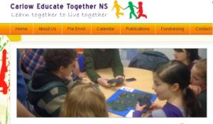
Choosing a colour scheme can be fun. Carlow Educate Together chose the Carlow flag colours of red, yellow and green as inspiration.
 Another school, Barefield NS in Co. Clare took inspiration from their school logo with a lovely blue/red colour scheme.
What you are trying to avoid is garish schemes. Bright fluorescent backgrounds are difficult on the eye. Big patterned backgrounds with contrasting colours are also a no-no as it’s impossible to read the text underneath. I won’t embarrass any schools by posting examples!
Your writing should be easily readable and you should avoid using “Comic Sans”, even though it’s the only font that has that type of “a”. If you have a dark background, a white or very light grey font should be used. If you have a white (or light background), black is usually best. The font size should be at least 12px in size.
Additions to Web Sites
When designing a school web site, one has to think about parents and what information they want to get access to quickly.
On my school’s web site, one of the prominent features is a diary, which shows the school’s next 5 items on the school calendar.
In our case, our diary is placed on the front page and automatically updates itself from our Google Calendar using a special plugin for WordPress. However, if you are designing your web site in a different package, one can easily get the code for displaying your calendar from your Google Calendar sharing settings. If you don’t have a Google Calendar, simply popping in the information manually is just as good!
Another thing that schools can do to communicate with parents is to post up any letters, policies and newsletters on to our web site. This is a simple enough process and can spell an end to notes getting lost in the bottom of schoolbags. My school publishes a newsletter once per month and it is uploaded to the Internet using the site Scribd.com. Parents can read newsletters as far back as July 2008, two months before the school opened!
Policies are another handy thing to have on a school web site. Parents can have access to any policy they need without having to ask the school. Many schools are starting to put up their policies now.
A contact form is another way for parents and the wider community to interact with the school. Creating forms is getting easier all the time. Depending on the package you use to design your web site, there are different ways to do this. Any contact form should have sections for the user’s name, email address and comments at very least. Other fields could include a contact phone number, a list of common questions, etc.
If your school has a YouTube, Twitter or Facebook account, there are tools to show your latest updates on the school web site.
I hope these tips will be of use to your school. Last month we were contacted by Crehana NS to see if we could offer our advice to improve their new web site. The school is based in Co. Waterford.
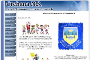
Above is a screenshot of the home page. As you can see, the colour scheme chosen is nice and subtle. The text chosen is easy to read too. The menu is well placed on the left hand side and it is easy to access the different pages on the site. The front page has a few parts to it.
Firstly, there’s the top banner. This banner is is simple and has the name of the school is big writing and the name in Irish below. There is no school logo in the banner. Rather than putting the name of the school in Irish, the second line might be better suited to putting the address of the school so users would easily tell what county the school is in. (I had to go to the Contact page to find out where Crehana was)
Under this there is a ticker feed, which simply welcomes users to the web site. It is a little bit distracting and could be changed to a static welcome. A nice touch is displaying the day’s date, which automatically changes each day.
The main content of the front page is divided into three. The top left gives a welcome message, the top right is a large graphic of the school logo and the bottom part tells people that the web site is under construction. I would have a few suggestions around this front page.
There is heavy usage of clip-art on the front page. I think it would be better to use real photographs of the school, for example one photograph of the school and another photograph of the children doing an activity. It gives the site a more professional look. (see image below)
I’d also move the logo to somewhere at the top to blend in with the banner. I also suggest that schools should never use an “Under construction” label or graphic. These days, a school web site is always under construction, being changed on a regular basis. Instead of the graphics there, I would suggest adding some dates coming up or post the latest news. One can even use the space to “show off” some of the school’s achievements.
I would suggest throughout the web site changing all the clip-art to photographs, where appropriate. The actual content of the web site is excellent and really well thought out. There is a lovely story about the history of the school and some great photographs of school activities.
The parents’ page provides very useful information and this is laid out extremely well. The enrollment page is also well done and utilises forms in a good way. A special page for Green Schools has yet to be completed but I would suggest filling it with project work from the children along with photographs of it in action.
The Kids’ Corner section of the web site is dedicated to showing the different things going on in the individual classes. As I said in my previous article, this can be a dangerous thing to do as it puts pressure on teachers to keep “their” class page up to date. On this particular web site, one class has nothing on it and another hasn’t been updated for 6 months. It is often better to bring all classes together in one page – perhaps the front page being the most dynamic.
Last Update: August 9, 2017


I look forward to reading these posts Simon, we are in the process of designing a new site for Wandesforde school, hope to have it live end Feb/early March
I just feel that putting this up over the coming “months” is just too little too late. I would have thought that if you want to design a website then get on with it. Holding over information like this is like those annoying magazines that “build up over months”.
I would suggest that the full article be put up at the start and then followed up by a forum for sharing information based on the website created. Users could check each others efforts and share techniques and info.
Dave
Thanks for the feedback Dave. I was hoping to get schools to comment and change the direction of the articles over the coming months. The idea of publishing every month is to give people a chance to read articles and discuss them. We found that having very long articles wasn’t working. We’re going to try it for the year and see if it makes any difference.
Simon,
I recently set up a website for my school. I used the Website X5 software to do it and found it really simple and easy to use. Feel free to use our website (www.crehanans.ie) as a what to do / what not to do reference! All suggestions as to how we can improve the site are welcome! Bear in mind though that it is still a work in progress and not all the pages are finished and all information / articles / policies etc uploaded!
le meas, Lisa
Hi Lisa
Sorry for delay in replying. We’ll definitely get round to reviewing your site in our April issue as we’ve run out of time before March. It will give you some extra time to add bits and pieces to it and hopefully the next article will help you out! I’ll add a footnote to the article to say that we’re going to review it in our next issue.